Our Favorite Summer Color Palettes
There’s so much to love about summertime — beach days, poolside afternoons, and ice cream stops on the way home after a day spent out and about. With longer days and warmer temperatures, it feels like there’s always something fun waiting around the corner.
Another one of our favorite things about the season? The color.
When it comes to color, summer puts on quite a show, from crystal blue water and vibrant green grass to flowers blooming in every color of the rainbow. Color is everywhere, which makes it an endless source of inspiration — especially in our interior projects in Charlotte.
Whether it’s soft green window treatments, pretty pink bathroom walls, or a natural neutral fireplace, our favorite summer color palettes often find their way into the spaces we design.
Take a look at our summer color palettes and tell us — what’s your favorite this season?
Tiffany Ringwald Photography

Tiffany Ringwald Photography
Tiffany Ringwad Photgraphy

Tiffany Ringwald Photography

Tiffany Ringwald Photography
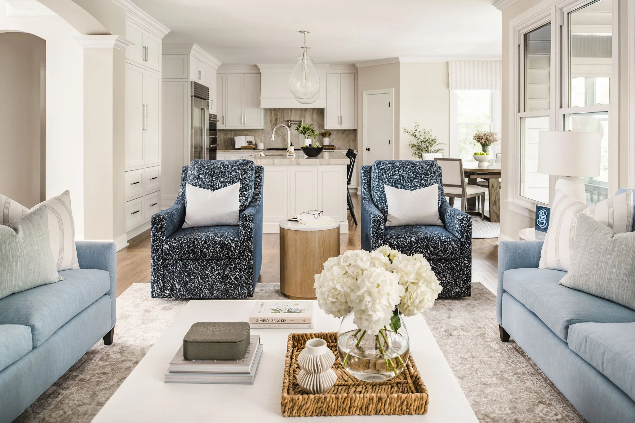
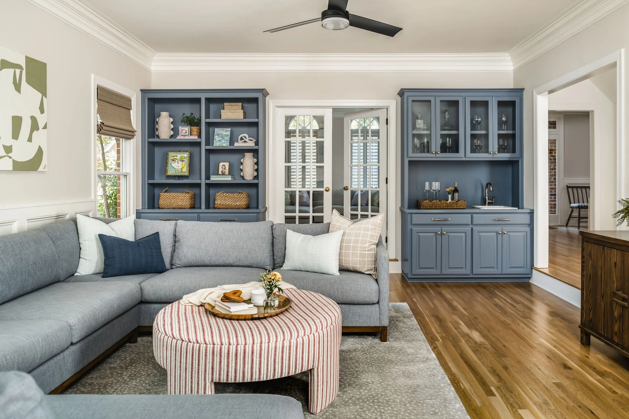
Blue Hues
No color reminds us of summer quite like blue. From clear skies and sparkling water to coastal landscapes, it's a hue that feels both refreshing and familiar. Whether it's a soft blue, a classic navy, or somewhere in between, we love incorporating blue into our projects for its timeless appeal and versatility.

Tiffany Ringwald Photography
Tiffany Ringwald Photography

Tiffany Ringwald Photography

Tiffany Ringwald Photography
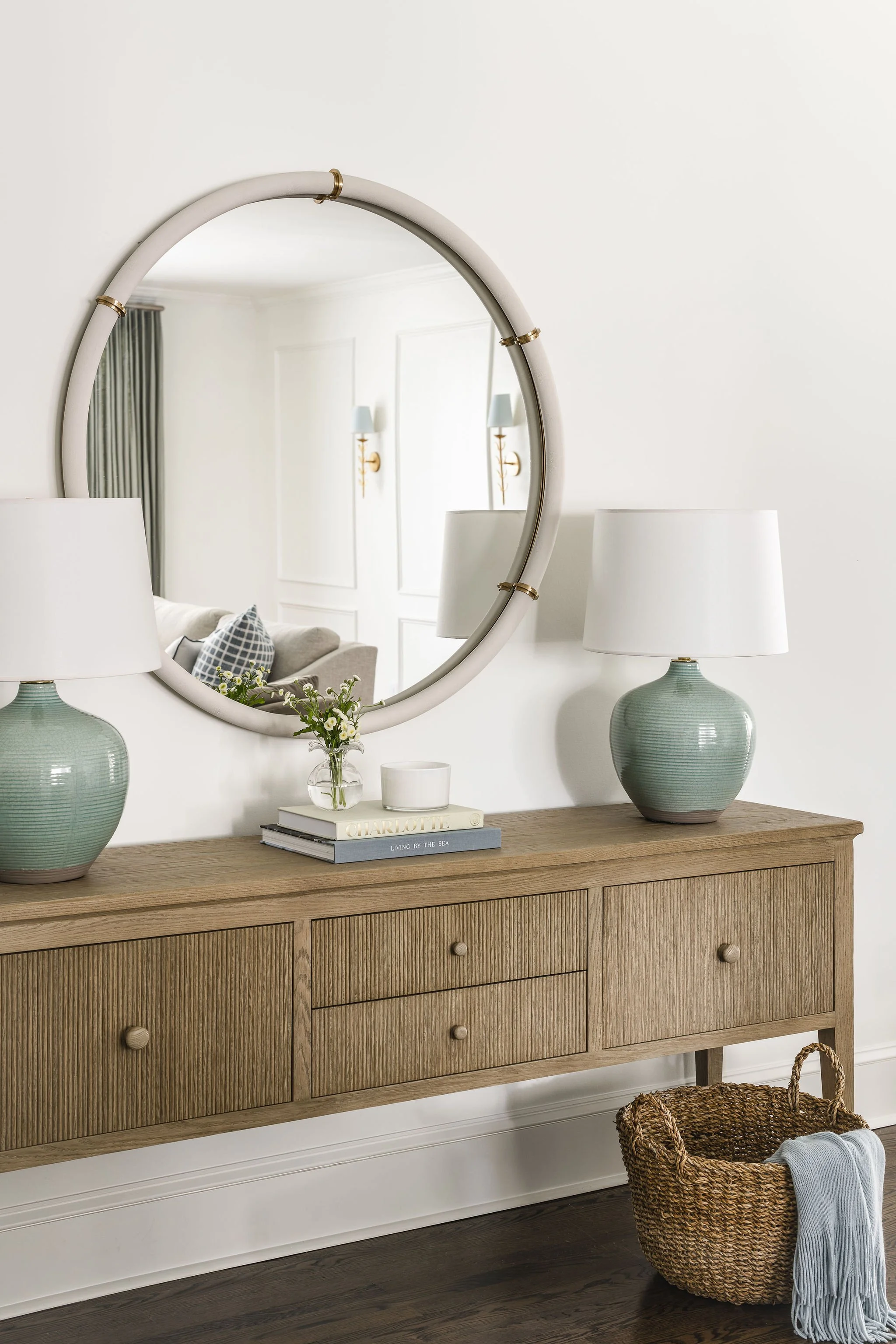
Soft Greens
We reach for soft greens again and again. They bring the outdoors in and remind us of garden blooms, sparkling sea glass and long days spent outdoors. Soft greens are subtle, calming, and endlessly versatile. Whether layered with natural textures or paired with warm neutrals, this shade creates a space that feels balanced and beautifully lived‑in.

Tiffany Ringwald Photography

Tiffany Ringwald Photography

Tiffany Ringwald Photography
Creams & Whites
A pairing we’re especially loving this season is summer whites, softened with a touch of cream. While bright white can sometimes feel a bit sterile or cold, layering whites with cream creates a space that feels fresh and breezy, yet still warm and lived-in. Whether in cabinetry, countertops, or furniture, it’s a palette worth revisiting.

Tiffany Ringwald Photography

Tiffany Ringwald Photography

Michael Blevins Photography
Pretty Pinks
Summer is all about light, playful, and sometimes nostalgic energy, which is why pink feels like such a perfect color this time of year. Its joyful, romantic quality captures the spirit of the season beautifully. From peonies and hydrangeas to sunsets and fruits like watermelon and grapefruit, pink shows up in a natural way, making it one of our favorite colors of the season. Pretty, fun, and beautifully versatile, it’s a go-to in our design work.

Tiffany Ringwald Photography

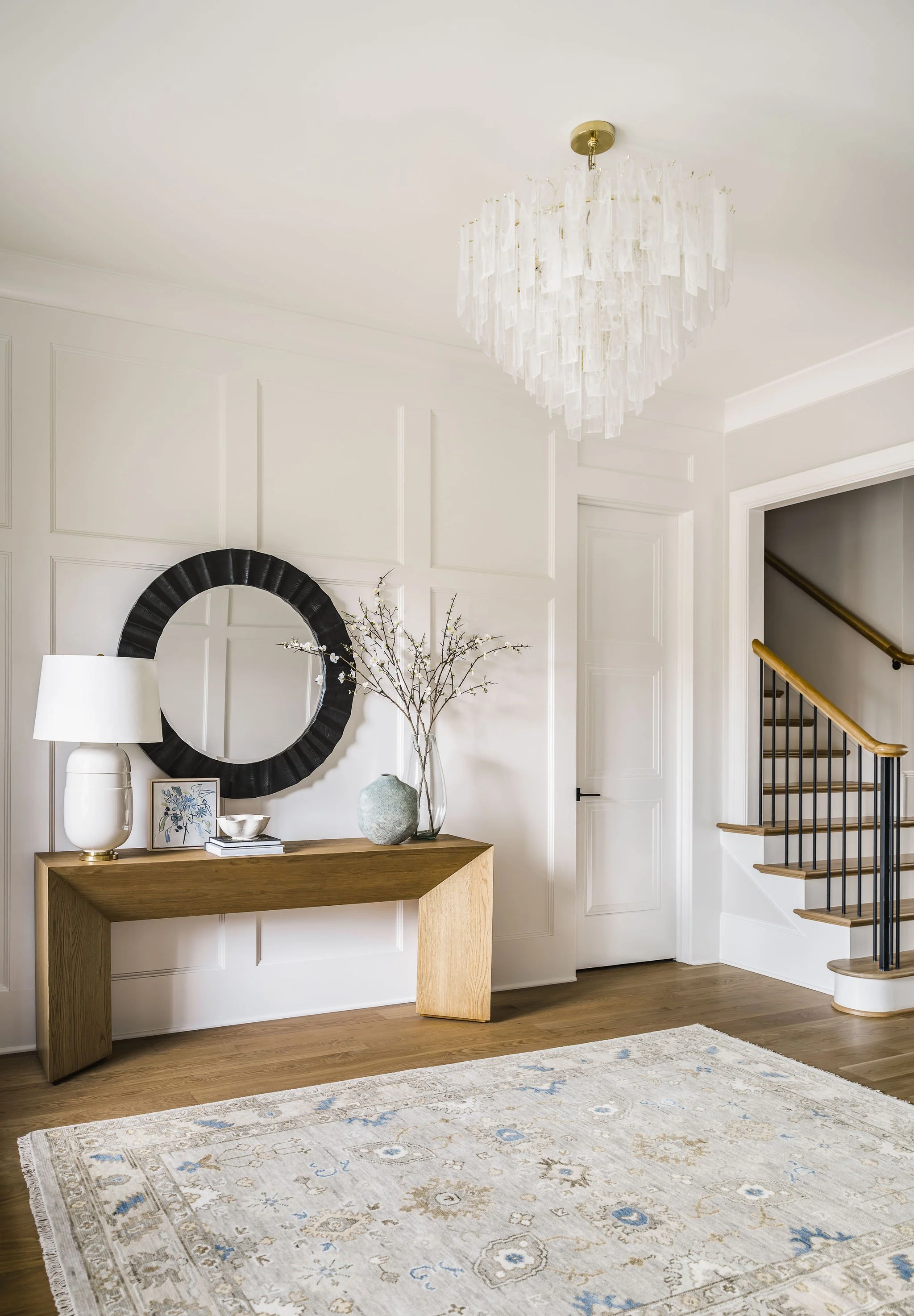
Natural Neutrals
Natural neutrals is another favorite palette this summer and it’s easy to understand why. Soft sand tones, warm whites, and organic textures create a palette that feels airy, calm, and effortlessly timeless — perfectly capturing the relaxed ease of the season. Spaces that incorporate these colors and materials feel inviting and effortlessly livable.