
Our Top Five Furnishing Tips
When it comes to furnishing spaces for our clients, a familiar set of questions often arise… “How big should my rug be?” “What’s the ideal height for my artwork?” “Do I really need window treatments?” The answer is yes, you do need window treatments. ;) Now that we’ve got that out of the way… creating a space that exudes an unmistakable designer touch is a dream many homeowners aspire to achieve, and we are here to tell you that’s it’s not as difficult as you may think. The truth is, anyone can elevate their home to designer-level standards with the right guidance and a dash of creativity. This month we are providing that guidance and sharing our top five furnishing tips!
Tiffany Ringwald Photography
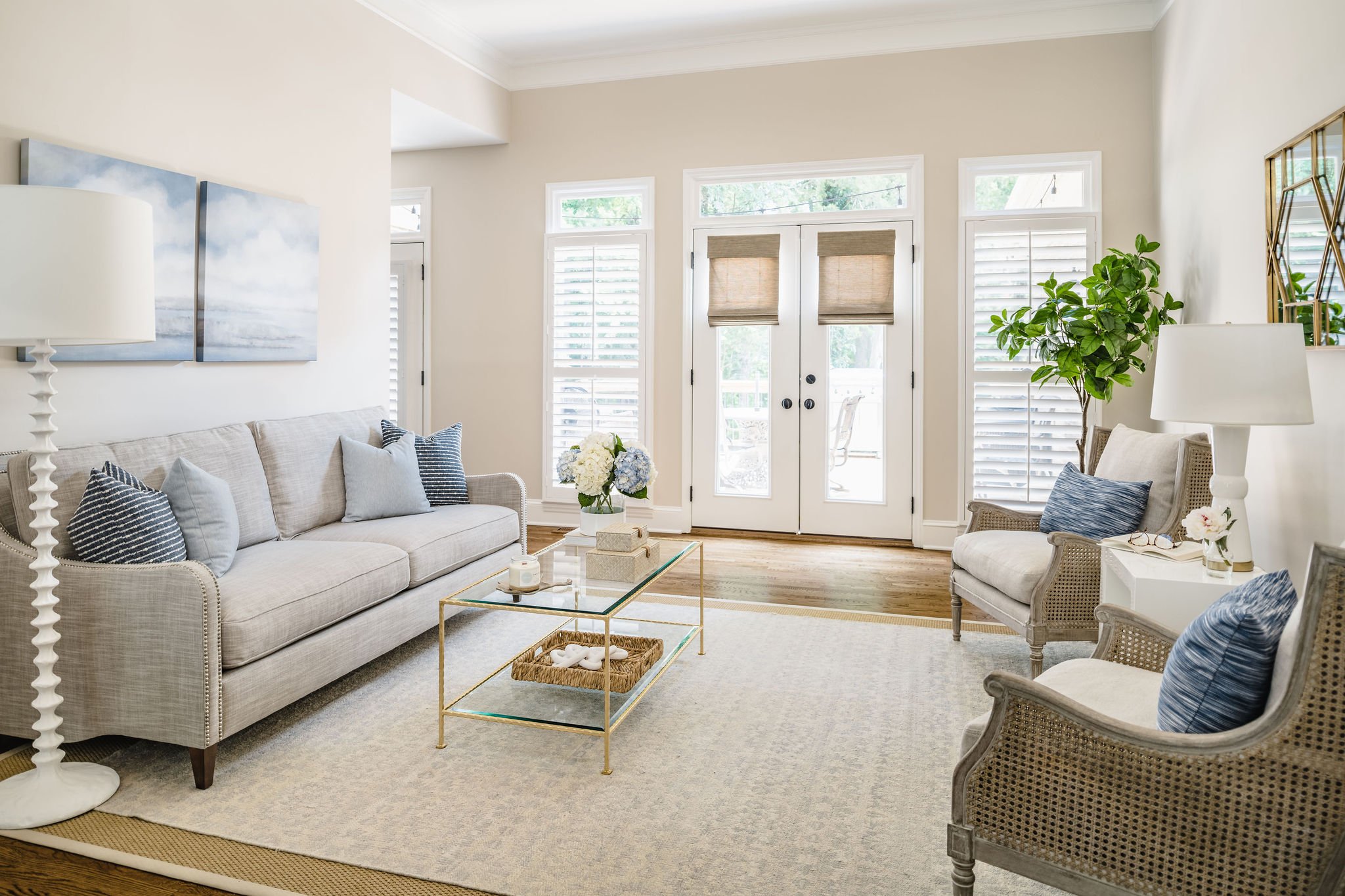
Rug Sizing
Roll out the rug, but make sure it’s the right fit! Rugs play a crucial role in transforming and improving the overall feel of a home; they can infuse color and texture into a space, add warmth, divide open concept spaces into cozier areas, and have the magic ability to make a room feel larger, if you select the correct size. The biggest rug faux pas that we see is when a rug is too small for a room. When space planning for our clients, we make sure that the rug is large enough to sit underneath the front legs of the sofa and chairs that it grounds, not in front of them. In order to ensure a seamless blend, we want the rug to disappear under the furniture. If you want to add even more dimension to your space, we suggest layering rugs, just as we did in our Asheford Green sunroom.
Tiffany Ringwald Photography
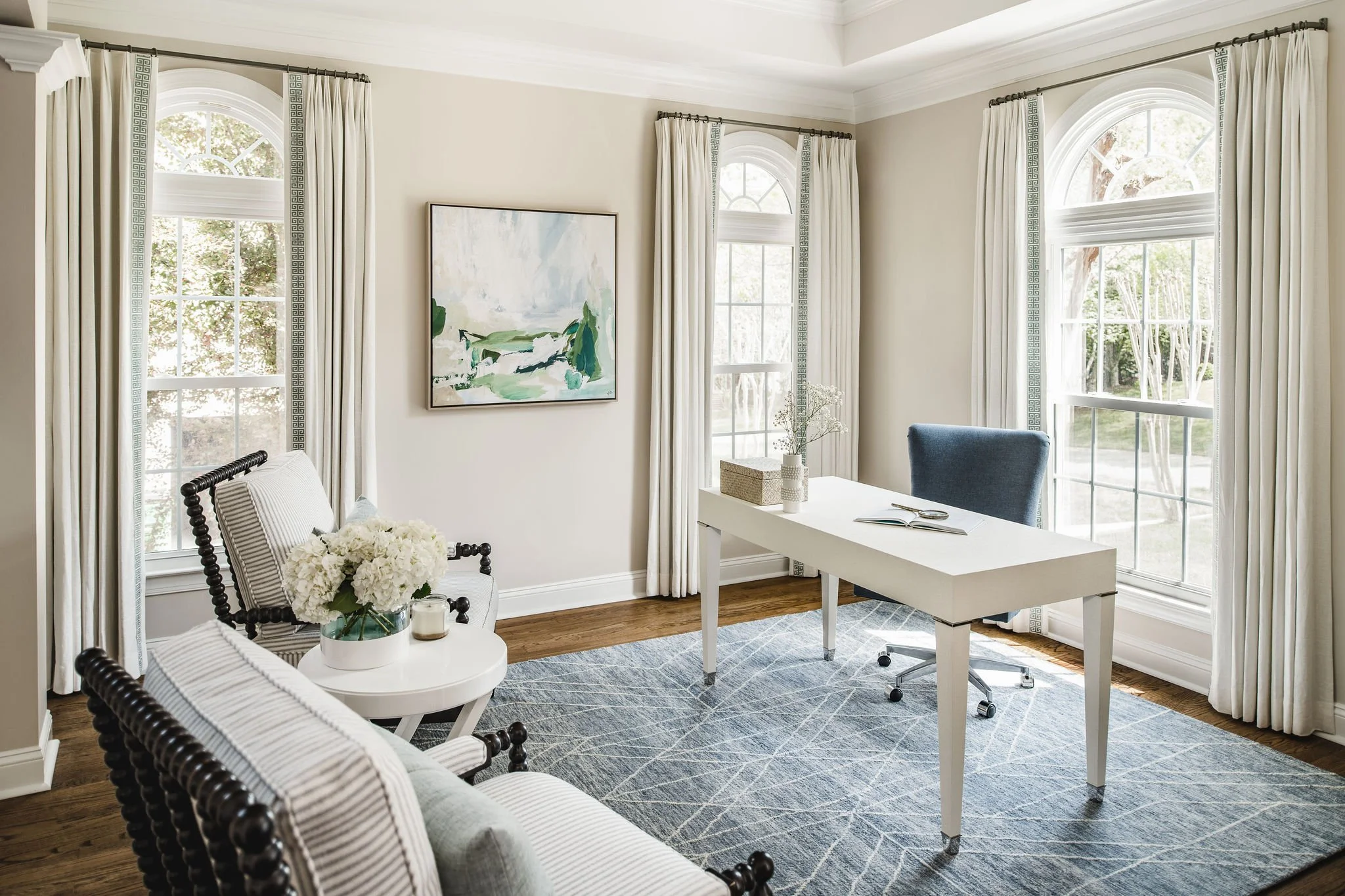
Window Treatment Height & Length
If you’re asking if you need window treatments, the answer is always YES! Window treatments are not merely a finishing touch, but also provide privacy, shield your space from harsh sunlight and add warmth and personality to a room- they complete the space. However, there are two common pitfalls that we se often: the height & length of a window treatment. When installing window treatments, mount the hardware a couple inches below your crown or ceiling for ceiling heights anywhere from 8’ - 10’ and the panels should end approx. 1/2” above the floor. Mounting your window treatments close to the ceiling helps to draw your eye up and elongate the windows as well as make your room feel taller. You also want your panels to almost graze the floor without touching. You can compare it to getting your pants hemmed- you want them to be just long enough, but not too short. If you over hem, they look a little silly and if you don’t take enough off, they drag when you walk. Leaving a little space will help to prevent dust build-up and to ensure that your Swiffer or vacuum can clean underneath without getting caught. Being in Charlotte, we’re lucky to partner with Chancery Custom to bring our clients custom-made window treatments for their home, just like in the home office of our Dansing On Providence project.
Tiffany Ringwald Photography
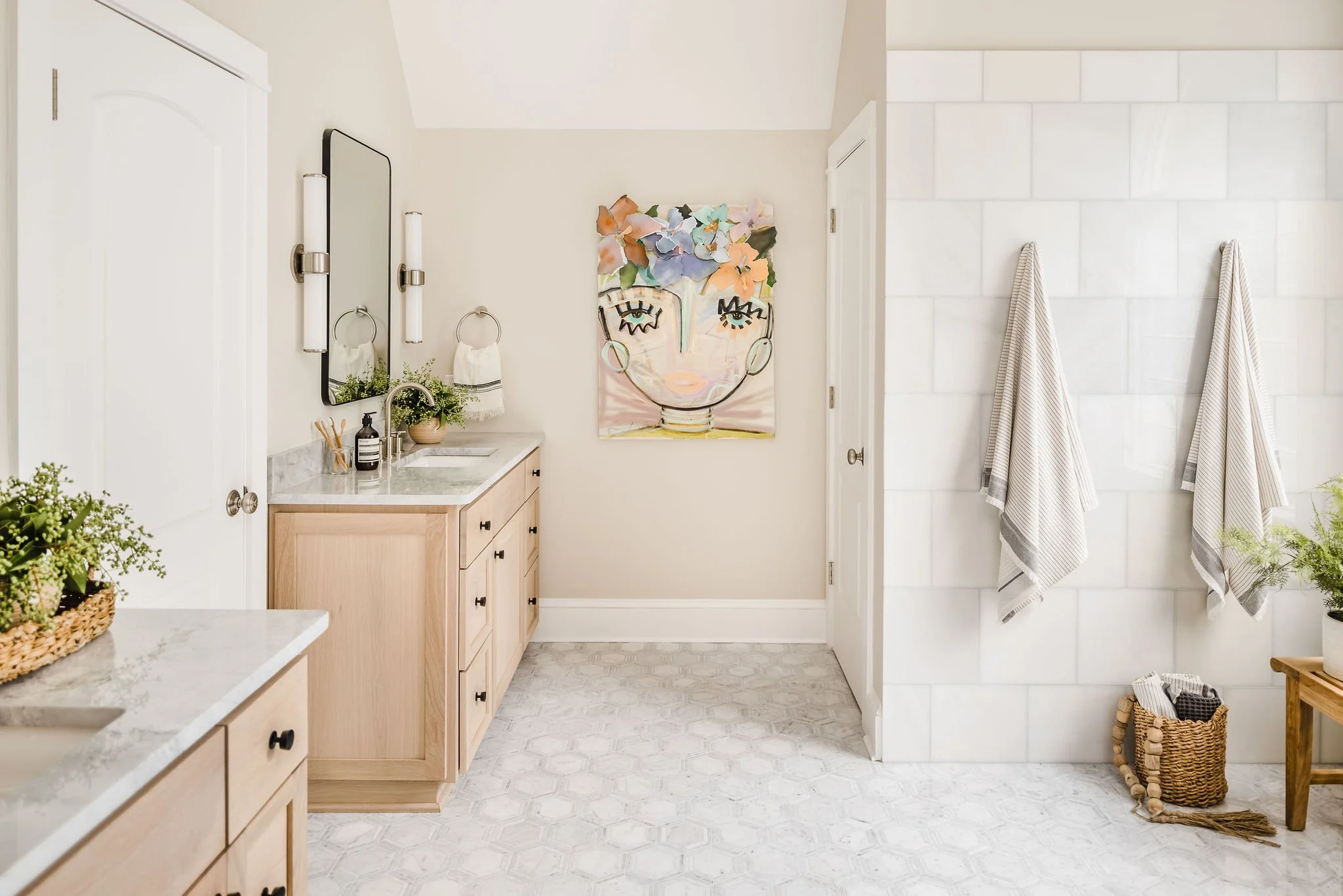
Positioning Artwork
Adding artwork is a quick way to instantly elevate a room and can make each space in your home feel polished and personal. Since selecting the “perfect” piece of artwork for a particular space is already a pretty daunting task, hanging the artwork doesn’t need to be. To ensure your artwork finds its place on the wall, follow this simple guideline. Traditionally, the rule of thumb suggests placing artwork at “eye level.” However, to provide more precise guidance, we recommend positioning the center of the art at a height of 57”-60” from the floor. The Chica collage in our Beaver Dam primary bathroom is a perfect example of this.
Tiffany Ringwald Photography
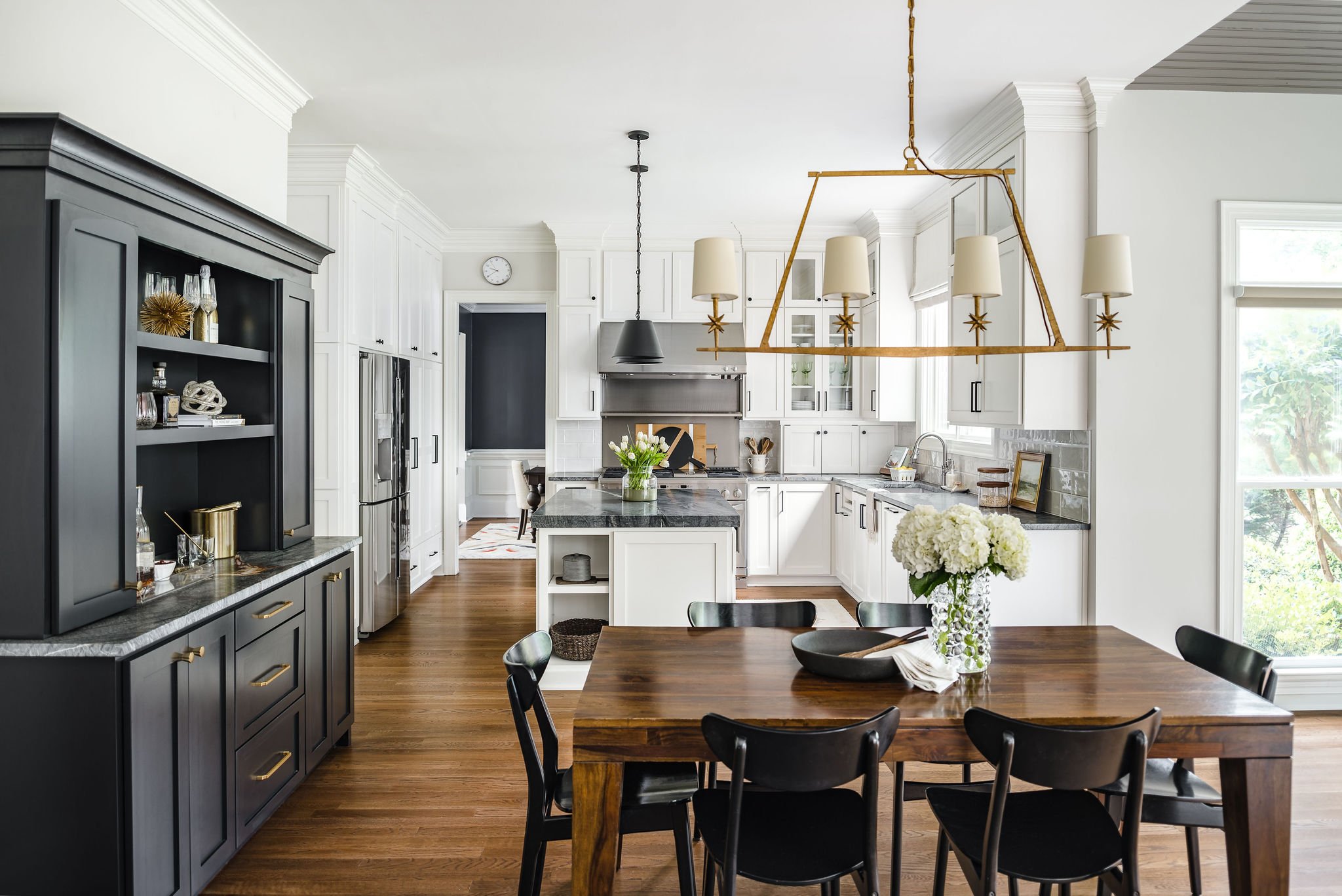
Coordinate, Don’t Match
Our favorite mantra? “Coordinate, don’t match!” When selecting materials for a room it’s important that they all coordinate with one another, without being an exact match! Vary your fabrics, materials, finishes and furnishings to create a dynamic and balanced space. The goal is to keep the eye moving, avoiding fixation on one element or one part of the room. Think of using the same color palette without using the exact same colors. Our Beaver Dam project illustrates our mantra perfectly. You can see that we blended elements of dark and light, metal and wood, and shiny and honed throughout the kitchen/bar/dining areas to create a cohesive and complimentary space.
Tiffany Ringwald Photography
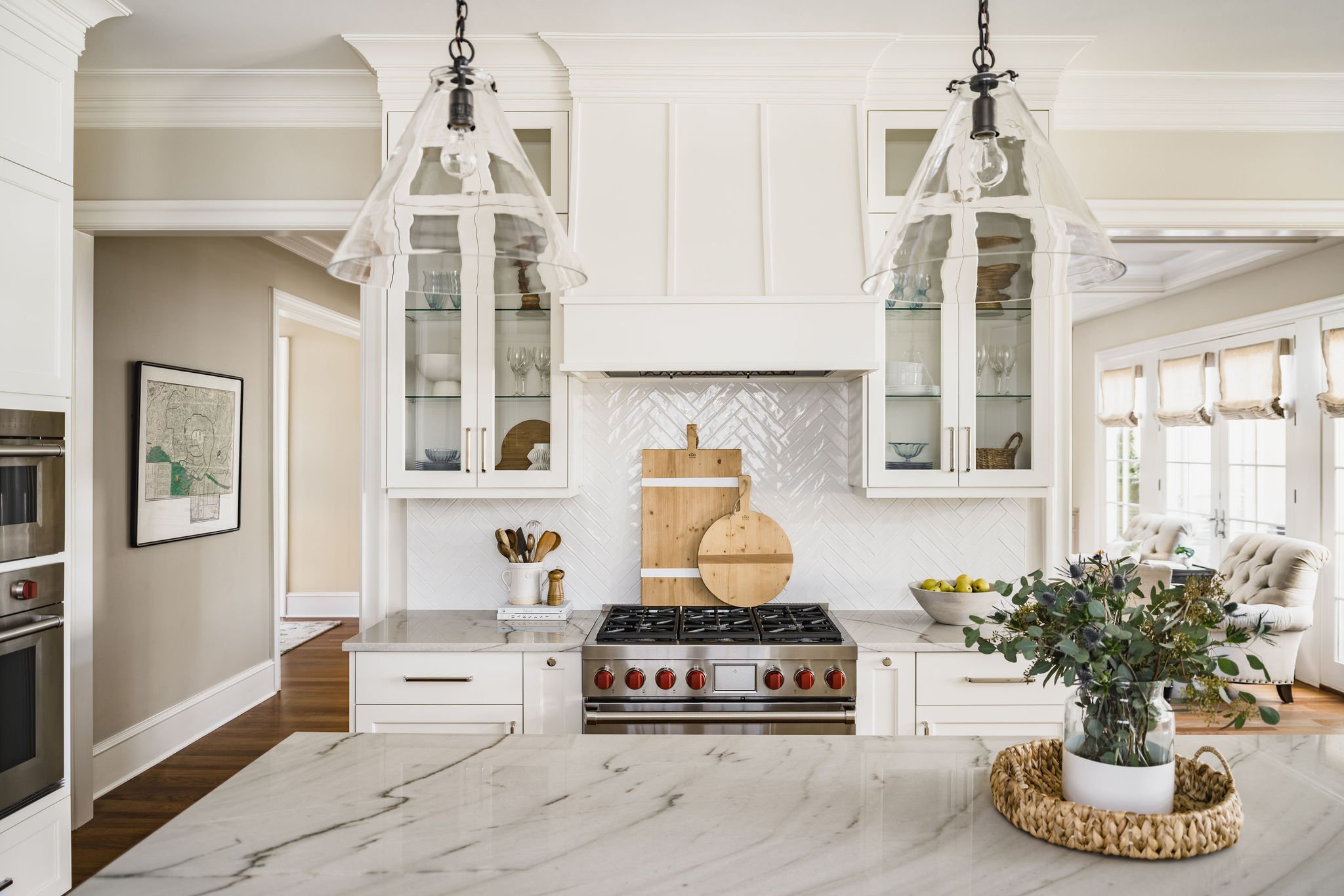
Layer, Layer, Layer
Want your space to stand out? Layer! We love creating layers to add dimension and depth, and to keep the space interesting, too. Layering gives that extra element of intrigue, but in an effortless, pulled-together way. Lucky for you, in kitchens it’s pretty easy to do! Layer cutting boards with varying heights, a crock over books, a bowl with fruit or even a vase in a basket like we did in our Charlotte White Christmas kitchen. Aim for a slightly asymmetrical look. Pro design tip- don’t forget about functionality. Keep kitchen tools handy and glasses within reach so that you can easily manage your day-to-day kitchen needs.