
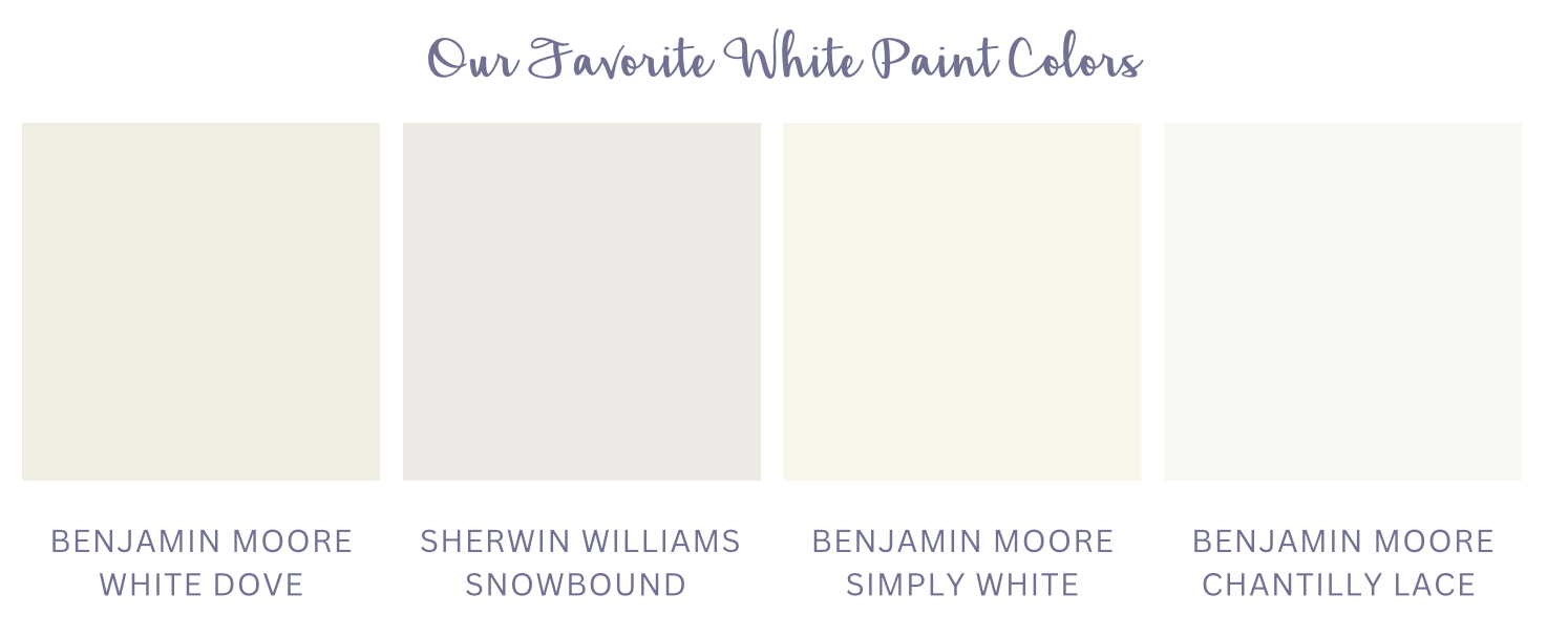
Our Favorite White Paint Colors
Spring is in the air and that has to mean one thing… it’s time for a little home refresh! One of the easiest things you can do to refresh your space is to add a new coat of paint. Sounds simple enough, right?
Perhaps that’s the case if you are selecting any color besides white, because as we all know, choosing this color for any space can be challenging. Raise your hand if you’ve ever felt overwhelmed selecting the “perfect” white shade (our hands are raised, too!)
It’s no surprise that finding a white that’s not “too” gray, or “too” yellow, but “just right” isn’t the easiest job - after all, there are over 200 shades of white paint! Lucky for you, we’re here to help demystify the ominous white paint colors.
We’re sharing our top four white paint colors from a soft and versatile white to the brightest white we often choose.

White Dove
One of the warmest whites we gravitate towards is White Dove by Benjamin Moore. Due to its creamy undertone, it is a favorite of ours, particularly for kitchen cabinetry. One of our favorite qualities of this shade is that it can both brighten and soften a space at the same time. It’s worth noting that White Dove does have a bit of a yellow undertone, so to avoid this color reading yellow, we advise not to pair it with brighter white paint colors. In our White Christmas project, we selected White Dove for the cabinetry, trim, and ceiling. We love that the kitchen is a bright, welcoming space without feeling sterile.

Tiffany Ringwald Photography
Snowbound
Slightly less warm than White Dove, with a bit of a gray undertone, is Sherwin Williams’ Snowbound. Snowbound is the perfect white when you want your space to read white, without feeling“too white.” In our Dansing On Providence kitchen we opted to use it for the cabinets, trim and the ceiling color. This is something we often do when we use white. We tend to pick one white color for a space, but we vary the finishes depending on where the paint is being applied. For example, with the cabinets we used a satin finish, for the trim a semi-gloss finish and for the ceiling a flat finish.
Tiffany Ringwald Photography
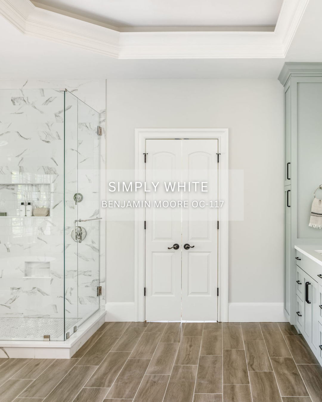
Simply White
Simply White by Benjamin Moore comes across as a crisp, clean white paint. This color is a go-to of ours for trim and ceilings, as seen in our White Christmas primary bathroom. It has the slightest hint of warmth, which we love, and it pairs nicely with both warm and cool colors. We have also used this color on walls and cabinetry, but as it is a brighter white, we are conscious to incorporate elements with warmer tones and texture to avoid making the space feel too ‘cold.’

Tiffany Ringwald Photography (to be edited)
Chantilly Lace
The brightest white we have on our list is Chantilly Lace, by Benjamin Moore. When it comes to white paints, this is a classic go-to. It’s a bright, crisp, clean white with a blue undertone and we use it when we want to really brighten up a space like on the walls in our Finding Forever On Abingdon primary bathroom. If you choose to use Chantilly Lace in your own space, we recommend that you balance it with warm accents. As you can see, it works well in this space because of the warm wood vanity, dark floor tile, and warm decorative accents.