
Our Favorite Blue Cabinet Colors

There is just something about blue. Perhaps since it’s the color of the ocean and the sky, it evokes a sense of calmness? Or maybe it’s because it’s significant in so many areas of our lives especially here in Charlotte - Carolina Blue, anyone? Or maybe Duke? We may be stirring up a rivalry here. ;) Regardless, we love it and we know so many of you do too!
Blue is one of our favorite colors to incorporate into an array of spaces and we use it in almost every design project. From small decorative accents to custom made drapery and fluffy throw pillows, blue is our go-to color palette. Whether we’re using a shade of pastel or a deep navy, blue is a versatile color that can create a calming, serene atmosphere or a bold, dramatic look depending on the direction you want to go. Plus, it acts as the perfect partner for countertops, paint colors, hardware and furniture.
It’s no secret that cabinetry is often our ‘something blue’ in a project and it actually might be our most favorite way to incorporate this versatile color. We have used it in both kitchens and bathrooms and we never grow tired of it. We see blue as a neutral color- it’s truly timeless.
This month we are sharing our go-to blue cabinet colors. If you are unsure whether to pick up a paint brush and ‘go blue or go home,’ take this as your sign to do so!
Michael Blevins Photography
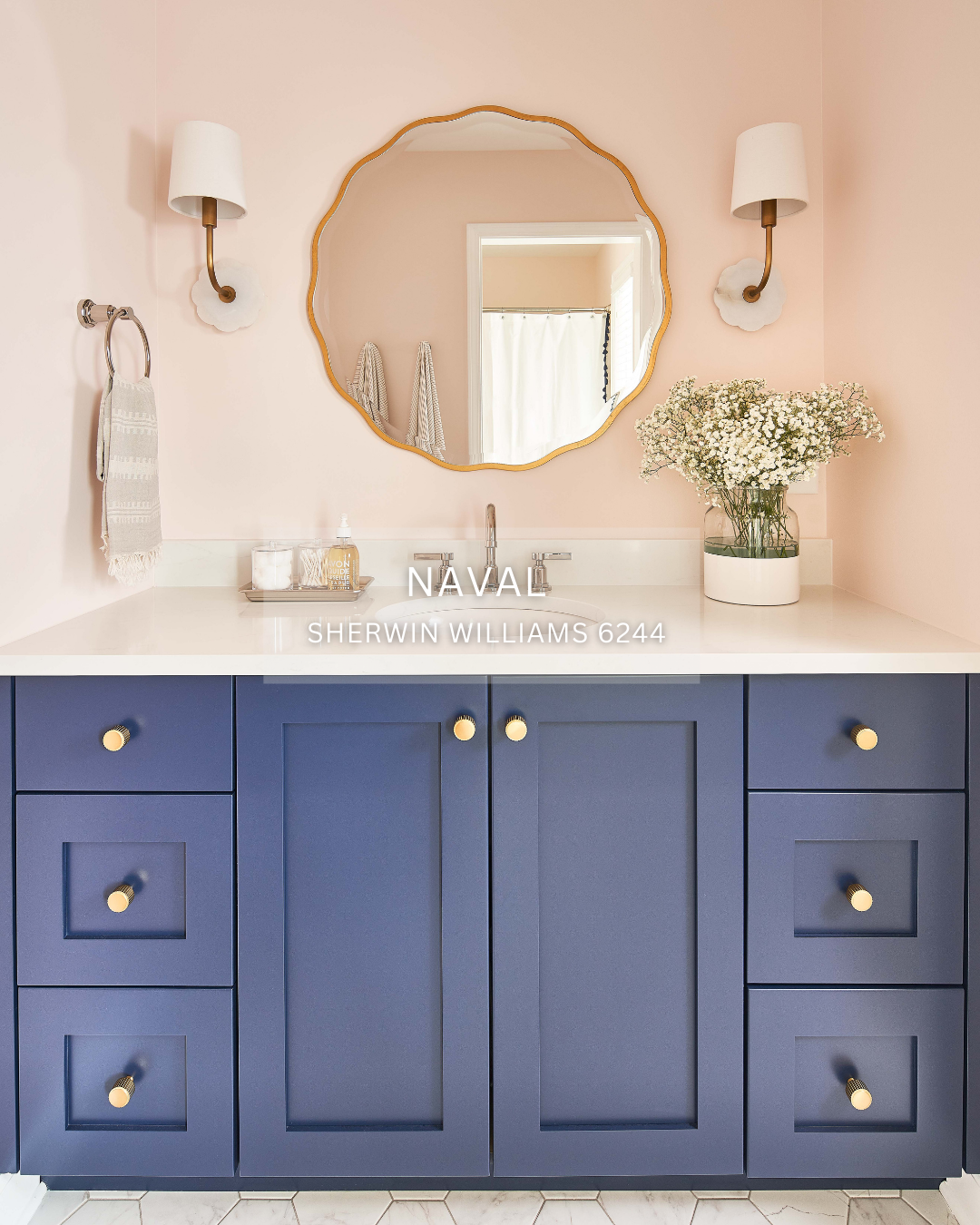
The beautiful deep blue color that we used in the daughter’s bathroom in our Hurtt So Good project is Naval by Sherwin Williams. We think it’s the absolute perfect navy! In line with it’s name, it has a nautical feel but it doesn’t need to be only used in coastal inspired spaces. As it’s considered a true navy, with a bit of a cool undertone, it pairs well with warmer metals like gold and polished nickel.
Tiffany Ringwald Photography
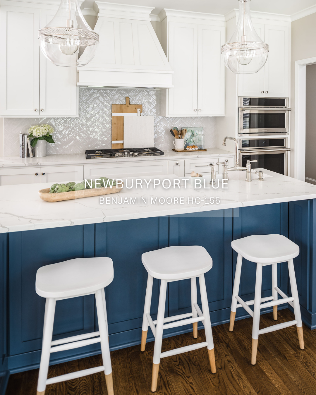
Unlike the deep and rich blue of Hale Navy, Newburyport Blue, also by Benjamin Moore, is brighter and “bluer” if you know what we mean! It’s subtle, yet strong, and anchors a room because of its vibrancy. It really pops when paired with white, light colors, and warm wood tones. We loved using it as an eye catching accent color for the island in our Asheford Green kitchen.

Hale Navy by Benjamin Moore is one of our favorite blue hues! It’s a true rich navy and reminds us of the perfect navy blue top from J.Crew circa 2005! Hale Navy is considered a transition color so it has both warm and cool undertones, meaning it can be paired with almost any color. In general, we gravitate towards metals with warmer undertones but if you prefer cabinet hardware with a cooler undertone, Hale Navy is still your gal! We selected this gorgeous deep hue in the basement kitchen of our White Christmas project as we wanted to incorporate a timeless color in the space without going too bold.
Michael Blevins Photography
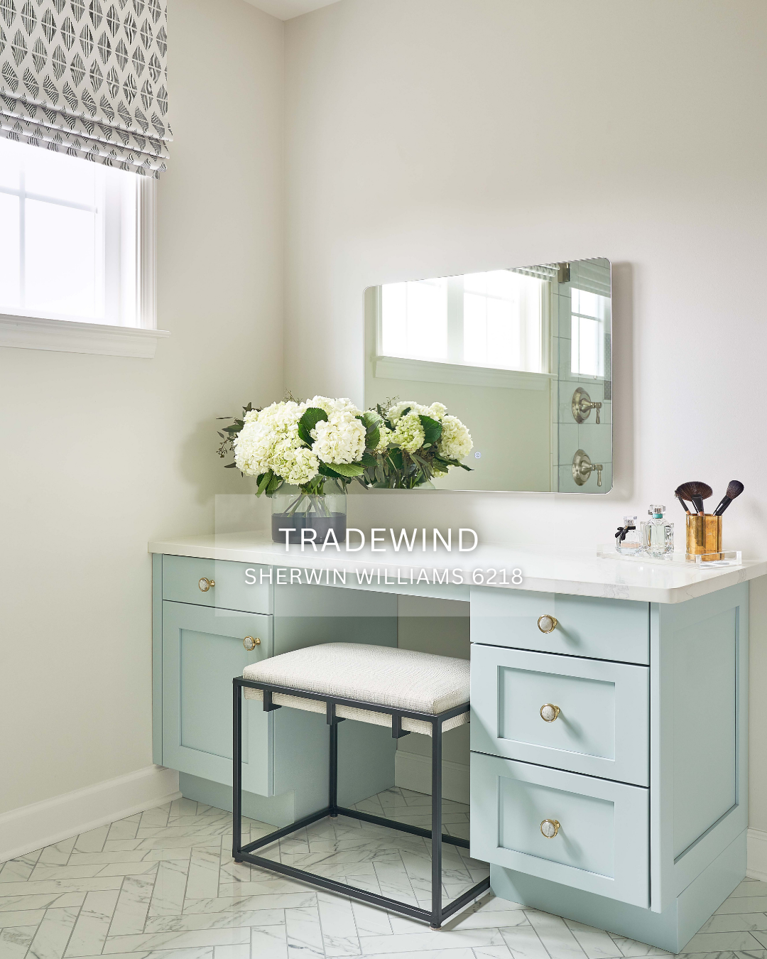
We simply can’t get enough of Sherwin William’s Tradewind. It is light, airy and talk about evoking a sense of calmness! It’s pretty on walls, but we think it’s even prettier as a vanity color. Although Tradewind has a cool undertone, we love the way it pairs with warm brass hardware as seen on the beauty vanity in the primary bathroom of our Hurtt So Good project. This powdered hue is quintessentially coastal and since everyone at Delphinium Design is a big fan of the beach we are smitten with this shade.